Center Line - Case study
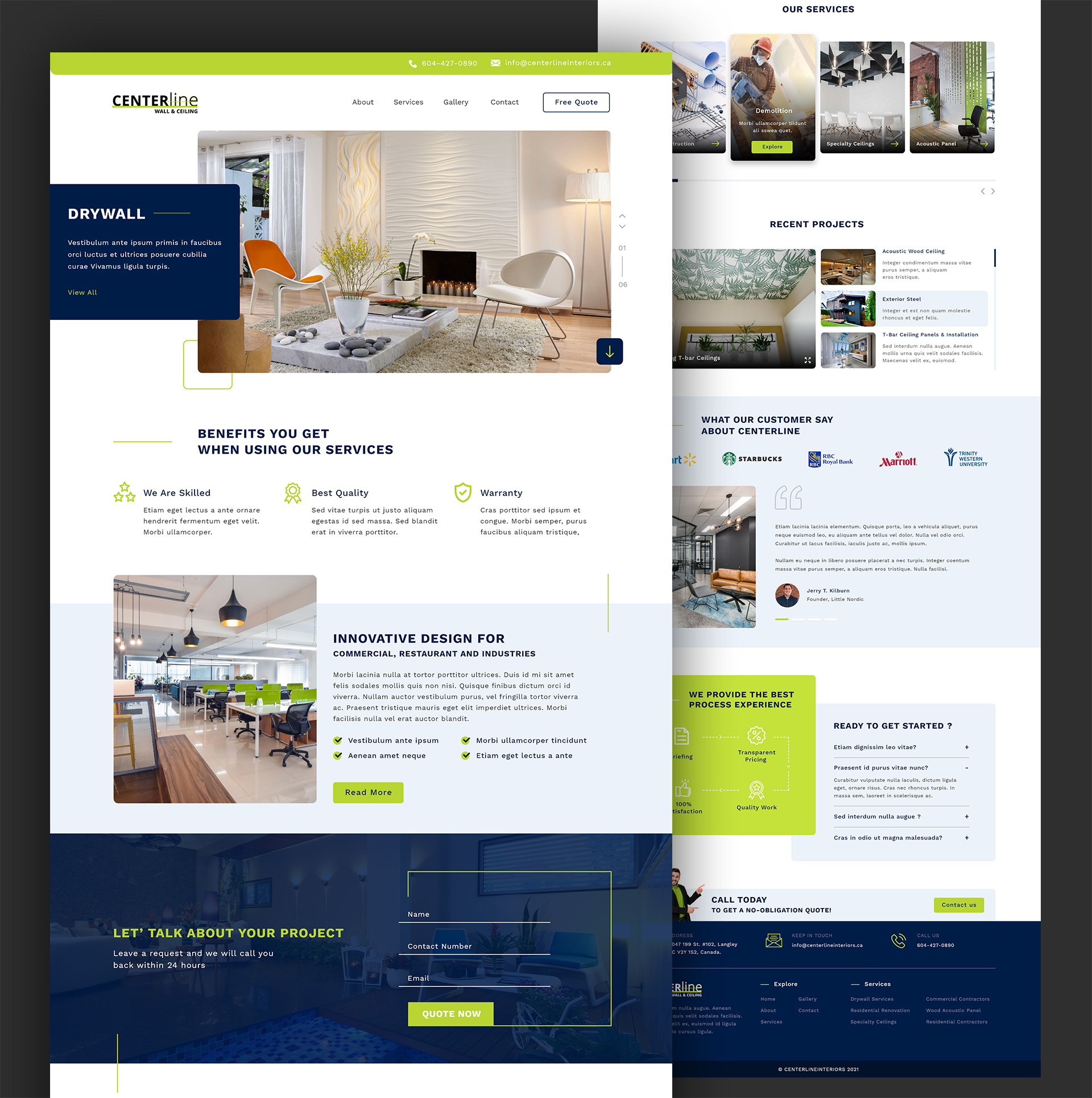
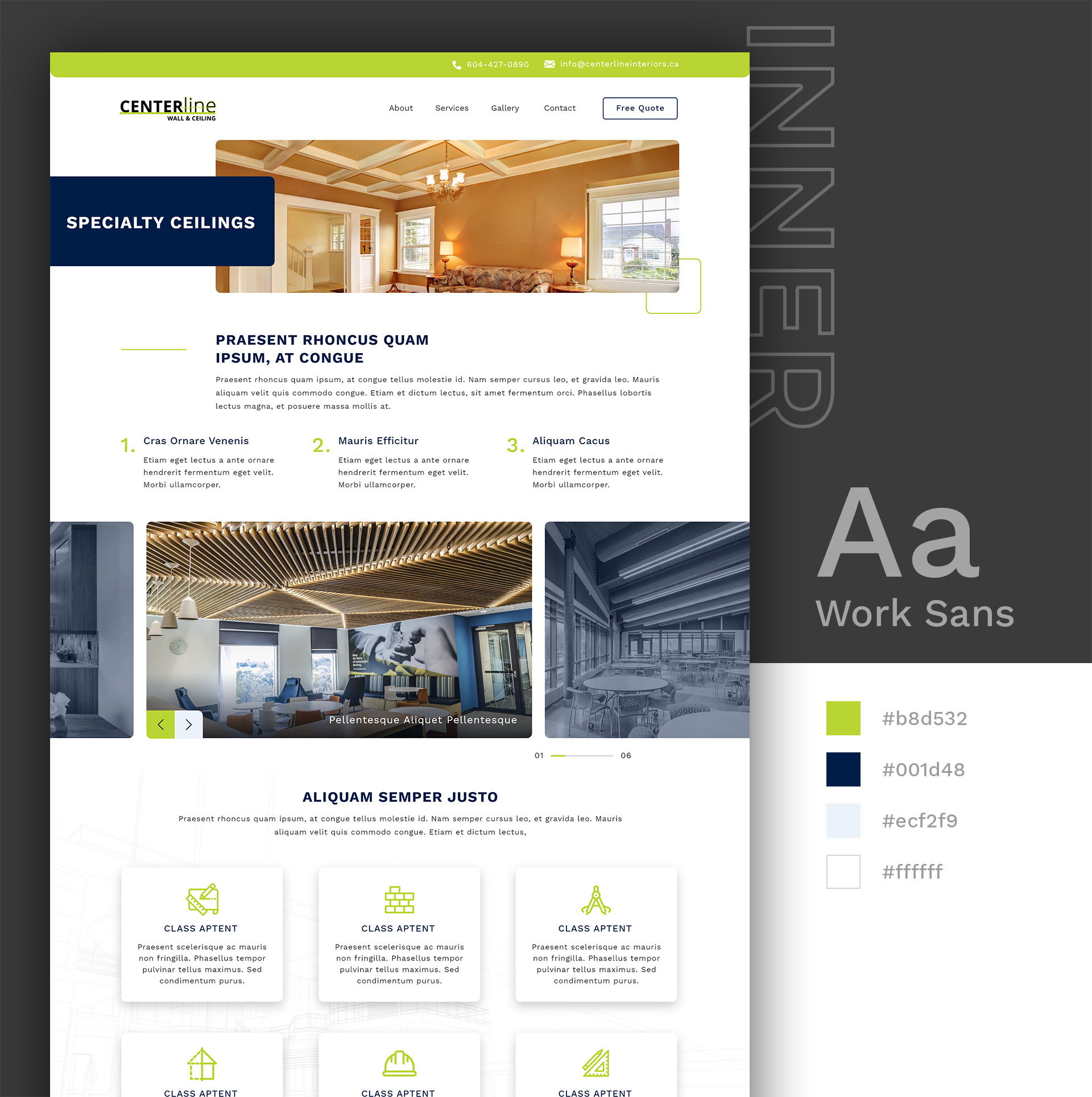
The "Center Line" project is a website design for a home interior company specializing in wall and ceiling solutions. The design cleverly incorporates line elements throughout the website to align with the company's name and emphasize the structural aspects of their services. Here’s a brief breakdown of the key elements and structure for the "Center Line" website:
- Line Elements: Use of lines in the design to create a visual theme that echoes the company's focus on walls and ceilings.
- Color Palette: A sophisticated and clean color scheme featuring navy blue (#001d47), vibrant green (#b9d533), and white (#ffffff) to convey professionalism and creativity.
- Highlighted CTA: A prominently featured "Free Quote" button in the menu to encourage user engagement and lead generation.
- Introduction Section: "Let’s Talk About Your Project" with a short form directly on the homepage to facilitate quick inquiries and interactions.
- Service Slider: An interactive slider detailing the services offered, allowing users to browse through options easily.
- Recent Projects: Display of recent projects to showcase the company's expertise and previous work.
- Highlighted CTA: A prominently featured "Free Quote" button in the menu to encourage user engagement and lead generation.
- Client Logos and Testimonials: A section dedicated to client logos and testimonials to build trust and credibility by highlighting positive feedback and successful collaborations.

